Friday, November 4, 2016

0.1 Progress and Menus

Greetings every one!

We've been hard at work here at Half Heart Games. We also had a week of great news for both Tristan and George. Tristan had graduated from his university and will soon be returning for his Masters. George on the other hand had just received a new job that he is very thrilled about.

They both worked hard to get where they are and deserve all the achievements they accomplished!

As for Fleet Calamity we've been hitting all our milestones and quickly coming up to the next part of development.
Here's what is completed:
1. Start and end turns
2. Draw cards
3. Shuffle cards
4. Implement options menu

Now we just need to:
1. Skip phases that you don't want to do
2. Complete match UI
3. Be able to enlarge a card to view it better.

Once these three tasks are complete - and they are just about done - we'll begin testing what is there and fixing any bugs. Once we feel we tested it thoroughly we'll move onto our next phase. The next on our to-do list is basically implement actual game play.

In the mean time here are a few screen shots of the game thus far. Take note that this is very early, but it is usable.

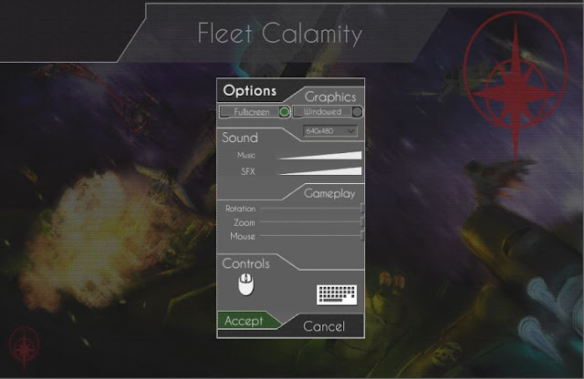
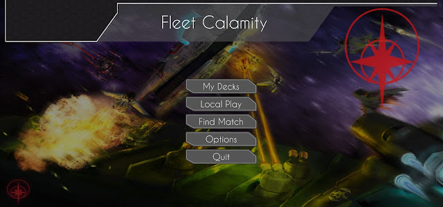
Main menu


Options menu (from main menu screen)


 Pre-game screen where you choose your deck and what opponent to play against


In game.


The in game screen looks the most empty because this is where that "Match UI" task is. We need to add things like the cards, the battle log, enemy flotilla, end phase button and the like.

To get an idea of what the GUI will look like in the game I created some examples to help point out the various GUI elements. In the images below the gui that is used in the given phase is left on the screen while all the other GUI is removed. It also retains all the base GUI such as the header, your resource pool and the skip phase section.

To begin with you'd draw your hand. This is done automatically for you so your turn will actually begin after this initial action.


Next you'll choose to warp or continue your turn. I'll be making a window that will appear, but the flotilla info will still appear to help you decide what flotilla you'd like to warp.


Thirdly you'll be able to discard cards and play cards. This will require you to use your hand and possibly any flotilla HUD.


Fourth phase is your move phase. This allows you to move any or all of your flotilla one space. You may want your flotilla HUD to help decide where to go.


Lastly there is the attack phase. This will only happen if you are in combat. If you are in combat you'll also have all this GUI displayed all the time - aside from the active Flotilla which will only display if you select it.


And of course when it is not your turn you'll still have GUI. The battle log and enemy fleet info help you know what your enemy is doing. It also allows you to react to an action your opponent may have done. You'll need your cards displayed so you can choose from them to do your reaction.


Well I hope this cleared up some of the GUI. Much of the GUI that is displayed can be hidden. The only GUI elements that can't be hidden are your resource pool (bottom left), the header (top), phase hub (bottom right) and your hand. However, if you use up your hand then you won't see any cards displayed.

Don't forget to keep checking in on our progress as we build up Fleet Calamity. Also, don't be afraid to ask questions or leave comments.

Lastly you can follow us and connect with us on Facebook and Twitter.
https://www.facebook.com/FleetCalamity/
+HalfHeartGames
 @HalfHeartGames

Thursday, October 13, 2016

Building up

Hello every one!

Thanks for checking in once again on the progress of Fleet Calamity.

This post will be a short one as there still isn't much to show visually. As I mentioned last time we are working on the backbones and inner workings of the game, thus there isn't a lot of visual detail as far as game play goes.

The most recent work has been focused on implementing card functions, such as drawing cards, discarding cards and gaining resources from that. We also have been working on various menu's so we can navigate through the game properly.

Speaking of menu's here are a few images of the menu's as they are now. Keep in mind as the game progresses these may change to accommodate the any new features or functions we need. The look may change as well to ensure everything blends well together.


Above is the options menu, you'll be able to open this menu from just about any menu using the gear icon shown in previous images of the GUI. Here (from top to bottom) you'll be able to alter whether the game is full screen or windowed, what aspect ratio your screen is, affect the volume of music and sound effects, the sensitivity of the camera rotation, camera zoom and your mouse. Lastly you can alter the key bindings for the keyboard and mouse.

Above is the pause menu. You'll be able to open this while in game and be able to return to to the main menu, exit the game to your desktop or resume the game.


I'll be sure to inform you all as we progress with the game play and any other aspects of the game.

In the mean time we are being sure to keep in constant communication to inform each other of up coming personal obligations as well as what we've been doing on the project.

Once the back bones are finished there will be more to show, but we need to make sure the backbones are made properly so it won't make more work for us in the future. This is one of the biggest aspects of the game followed by the card implementation. By "card implementation" I mean programming all the various unique aspects of the cards. This will take a lot of time with very little to visually show, but it is a core aspect of Fleet Calamity.

Until next time feel free to follow us on Facebook at https://www.facebook.com/FleetCalamity
And/or follow us on Twitter @HalfHeartGames

Saturday, October 1, 2016

We're back!

Hello once again every one!

I apologize for the long period of silence and I'll be working on making sure that doesn't happen agian.

But let me catch every one up on the Fleet Calamity game and what has been happening with Half Heart Games. Some time ago the programmer I was working with started to get overwhelmed with life and work, as many of us do. Over time he couldn't help as much as he would have liked and also ran into a few road blocks, which I couldn't help with. Ultimately he decided to take a break from Fleet Calamity and eventually left the team all together.
Don't worry though, we didn't have a big fight or anything. He simply had more important things to worry about such as family, work and life as a whole. I still think he is a great guy, and I look forward to see what he does in the future.

As for Half Heart as a team and Fleet Calamity as a game I have some good news!
I put out some more feelers and wanted ads for programmers and this time I made sure I got more than just one person to help. This time I also used a great site called Teamup and through them I found some amazing people. I got a bunch of people who replied to my ad, but I eventually went with two programmers who are both very smart, fun and excited to see this project through.

This time I also wanted at least 2 programmers so I wouldn't run into some of the issues I had before with just one programmer. Now if one of them has an issue and doesn't know how to resolve it they can ask the other and talk it out. I personally don't know much -if anything- about programming so I often couldn't help with technical issues. However, now the two programmers are able to fix issues almost as soon as they crop up.

Having more people on the team, especially when they live half way across the world, requires a lot of communication to ensure we are all on the same page. To this end we often communicate on Skype nearly daily just to check up on each other and see what we all are doing, whether it is development related or just to see how we all are doing. If a big topic comes up we will then schedule a meeting at a time where we all can attend and express our opinions.
So far this set up has been working very well and we are plugging along pretty quickly. Having two people help out also makes the development process much faster.

As of right now we don't have too much to actually show as we are currently starting the programming all over from the ground up. One of the programmers is setting up all the states and ensuring everything is talking with each other while the other builds up those scenes and prepares all the cards to be used, such as the deck editor, shuffling and dealing cards.  Right now we are moving into the actual game play as all the back bones are set up and functioning.

Here is a gimps of what we have thus far.

Above is the temp main menu. As we move forward we'll implement more of the correct GUI and functions, but for now this allows us to navigate the game and get to what we need.


Above is the temp deck editor. Most of this scene is ready to go, but as you can see some of the gui elements are not positioned correctly. Again, this allows us to work with what we need to, but doesn't give us all the bells and whistles. Currently you can just move cards from the overall library and place them into your deck. You may also save decks and use them in the main game.


Lastly, above here is the starting of the main game. The menu before this allows the player to choose between a human or AI enemy (although AI won't be implemented for some time). It also allows you to choose your deck, name your opponent. 

Like I said there isn't much visual content to show off as much of the work thus far has been behind the scenes, including setting up the team, getting the team all on one page, organizing the assets, getting version control up and running and of course programming the base of the game.

As we continue I will show off more of the game as it is built. I'll also share all the details of how we make decisions, solve problems and what we plan on doing next.

As I move forward I will attempt to update this blog weekly or bi-weekly depending on how much actually gets done.

Until then take care every one!

Make sure to join our facebook group @ https://www.facebook.com/FleetCalamity

and on Twitter @HalfHeartGames

Sunday, October 18, 2015

Back to back play tests

Greetings every one!

For the past few days I - Matthew - have had a few play test sessions at my place. The first one pitted my friend Niko and our new 2D artist Chris against each other. The second had my wife Jenn and our friend Evan duke it out. Then lastly we had a friend Greg vs. Chris, our 2D artist.


This was a great series of play tests and I actually live tweeted all of them at @HalfHeartGames. I've decided to live tweet the matches so people could follow along, as questions in real time and generally see what goes on.


Haddy and I have made a bunch of changes to the cards, decks and the overall game. Some of the big changes include warping, Rank ability and Generation ability. Let me explain those a bit.

It used to be that if you warp you could move 1 flotilla anywhere on the map, but that would end your turn. It was and is the second thing you can do in your turn, the first being draw until you have 7 cards in hand. Now we changed it so that you can only warp a max of 3 spaces away from your original location. It still ends your turn and it still is the second thing you can do in your turn. We found that warping anywhere could result in a lot of  issues, making it impossible to capture that flotilla and games would last much longer.

Rank up is an ability for Humans that would allow that vessel to increase in power, defense and/or movement. It used to be that you'd pay X amount of resources to Rank up, but that didn't feel natural or keep with the theme of the game. So haddy had the great idea to make it experience based. In other words the X wouldn't be the amount of resources you pay, but rather how many turns the vessel needed to be in combat. The longer it was in combat the stronger it would get.

Generations is a new ability for the Machines that Haddy also came up with. This ability is similar to Rank up, but more machine themed. How it works is if a card has generation (X) on it then that means that vessel needs to be destroyed X amount of times. If you do destroy that vessel the required amount of times then it turns into the next iteration. So for example a card called Mark 1 needs to be destroyed 3 times. Once it does then it is replaced with Mark 2, which is stronger overall. It also has generations so it can turn into Mark 3, which is even stronger.


 The first play test with Nikos and Chris didn't last too long as Nikos was stuck at work longer than he expected. Some things you just can't avoid and getting paid is higher on the priority list than playing games.
But either way he did arrive and I taught Nikos and Chris the game and changes that were made. They never got to use the Rank up or Generation ability, but they did use the new warp mechanic and it worked very well. There were other changes that Haddy and I made that helped make the game move smoother and overall were more enjoyable. This includes while in combat you draw until you have 7 cards in hand, which was previously changed so that you only draw 1. However drawing 1 card felt too weird to people.
Overall Nikos and Chris had a good time, even if they didn't get to play a full game. Since then Nikos has been raving about the game and constantly pitches ideas to me. One in particular is pretty interesting in which a cache drop would appear on the map, which could make the players eager to fight over whats inside. However, I'm still trying to figure out what would be inside the cache. I'm thinking maybe some resources that would be added to your resource pool next turn.

In the end the two didn't get to play much and thus I got limited feedback. Some times this happens, but some play is better than no play. I also have another play tester eager to come back for more.

Yesterday October 17th I had two game sessions running. The first was with Evan who has played the game before, but several months ago. He faced off against my wife Jennifer who has been watching Fleet Calamity grow since the beginning, but doesn't get to play much. Following them was a match between Greg who has played the game multiple times but has severe ADHD and getting him to concentrate is difficult to say the least. He faced Chris who is becoming ever more active with Fleet Calamity and Half Hart Games as a whole.

Overall we got a lot of feed back and learned a bunch about the game. I'll just touch on a few points as this post is getting long.
To begin with Generations is too hard to achieve. It needs to be easier and that's something I'll be focusing on for next time.
There were a few OP cards that have since been nerfed with the help and suggestions of the testers.
Rank wasn't used much primarily because not many of the cards in the human deck used rank.
Overall the human deck had a bunch of issues and was viewed as generally being weak in comparison to the machine deck.
Same issue with the Squad ability as with the Rank ability. Not enough of it for it to really matter.

I could go into more detail, but this gives a pretty good overall tone of the tests. The testers all very much enjoyed the game overall and thought the mechanics and structure was solid. Their complaints were mostly about deck and card balances, which is to be very much expected with a card game.

Moving forward we will be really looking at the cards and how they are used, if they aren't used and which are used more than others as well as why.

In addition to the testing I have also been working more on GUI for the main game. I've been adding a few panels for upgrades and traps so the player can view what is on the field, flotilla or vessels at any time. More on this to come!


Take care and don't forget to follow us on twitter @HalfHeartGames or like us on facebook https://www.facebook.com/FleetCalamity?view_public_for=245019235659967

Wednesday, October 14, 2015

DevBlog - Update to UI, continuing to move forward

Well hello again!

Hope you guys are having a great October, things are flying by on my end, so many different things going on... so little time! Been quite busy ironing out issues with pieces of UI components that I've had a hard time finding documentation on. Although I was unable to find the documentation, I was able to figure out how to use the outline component on Unity3d, which allows me to give colored tints to alpha'd graphics that I'm importing. This is a great thing, as it will allow us to modify current graphics, verses, having to bring in additional assets if we just want to do a light tint for selection or modification effect.


Beyond this, Matthew and I have had some further discussion on dynamics of upgrade cards, and I've also implemented a new log menu that slides in and out. This menu will give further option for the user to interact with the other player while the game is being played, allow a user to follow up on actions that are being done real-time, and could even include a chat feature at some point.

I will be moving the turn system into a more global system that will allow the user to interact with the cards in different ways with the mouse for selection, open, and deletion, verses move slowly through different phases of the turn. I am also going to be updating the in-hand cards ultimately to be more on a carousel verses just a vertical pane, that will loop as the player interacts, and center the current card selected. Beyond this, I need to get head-deep into starting to develop all the interactions of the cards, as that is a big obstacle to get done for this game to be playable.

Take care!

-Haddy

Wednesday, October 7, 2015

Devblog - A focus on refining the GUI

Hello Calamitors!

Well, hope you guys are having a great week. This last week I've been down sick (thanks random person at the store coming to share your sickness with the world), so my update last week didn't happen, because my work didn't happen!

As Matthew and I work together, we gain focus and clarity on what needs to change and improve for the game... we've worked on some new styling and have come up with some better visuals for the game. As always, with any rework, means more rework on the development side!  I have started implementing a new home menu screen, utilizing some of the new designs Matthew and I worked together on. Here's a screenshot of the home screen as it stands... still working getting all the other elements imported and implemented (not a high priority right now):


On the bottom, you can see update text, this will scroll as the game has new announcements available from the development team. Other interfaces  will be implemented here for navigating the decks, entering games, etc.

In other news, we've revised a bunch of the GUI for in-game, it looks a ton better, but takes time to revise as some of the sizing and positioning changed a bit. As you can see below, a lot has changed, but a lot has improved as well:


There are still things that need to be accomplished to finish the update to the interface, but a lot of the tedious stuff is out of the way! There's also the addition of the battle log area that will be utilized for text based logging, tutorials and actionable battle items to allow further clarity and information displayed to the user. With this update, the Flotilla GUI actually has been broken apart, so now I can implement custom GUI's for each ship, verses just a generic one across all Flotilla.

The next thing I will be focusing on is the rest of the players turn as the interface responds to his/her actions, then it will be on to getting cards performing actions during the turn (placing traps, etc). Got a lot to accomplish if we want to have a playable version next month!

-Haddy

Tuesday, October 6, 2015

Menu and GUI designs!

Hello, Hello!

Once again I'm happy to share with you all the awesome work we have done since our last post!

As of late Haddy and I took a good look at our GUI and thought of ways to improve it, make it more unique and visually pleasing. So away with the glows! Instead we added more textures to our designs and gave things more of an implied shape. But why simply tell when I can show?


 As you can see we added in the new card design, showing both an open and closed version of it. The cards would cycle as if on a wheel and the one you have open would adjust itself to the center and allow you to view it. Of course we'd allow the card to shift to the center of the screen and enlarge to allow you to easily see the card and read its description.

We also altered the flotilla HUD. Here we added those textures and gave it a more implied form, but the overall design was left untouched.

As for when in combat, there are two flotilla HUDs at the bottom of the screen. Currently they are represented by the Civilian ship and Resource ship, but in the game they would be whatever flotilla isn't currently in combat.
In addition, we added a vessel HUD. This small piece shows the vessels attack, defense and movement values. Any player can check out these values while in combat for any vessel, so you know what you are up against and thus can plan your strategy.

Finally we have another new addition, the "Battle log" and "Reaction button". These are newly designed to allow a player to react to any play in real time. If I set a trap and you wanted to react to it - to, lets say, nulify the effect- you'd hit the react button. It would then slide out the battle log and you'd select the instance in which you'd like to react to. A prompt would appear and ask what would you like to do. You'd play a card as normal while the other player is paused.

While reacting you'd have a set amount of time to make your move. This is to make sure a player doesn't pause your turn then leave for hours while you sit around. Instead they will have 30 seconds to react after selecting the instance they wish to react to.

Lets continue onto another part of the menu system. Let me introduce you to the Main Menu. The start up screen and what you'll be introduced to when beginning Fleet Calamity.


At the top right you once again have your options menu for sound, exiting the game and the like.

Next to the options menu is your 'Binder'. This will show you all the cards you have collected from all factions. It will also have empty spots for all the cards you haven't collected to show how many you still have to go to for those completionists out there.

Below these buttons is the "Begin battle" window. Here you can either find a match or host a match.
Finding a match will pop up the right side window labeled "Find a match". Here you'll be able to choose which opponent to battle. At the top there are several categories to base your decision on. First we have "Faction" which just shows what faction the player is using for their cards. Second is the "Win/Lose" section. This shows how many battles the player has won or lost, obviously. Next is the "Rating". This shows how well the player is liked by the community. This is a section we are still planning out, but basically the idea is that after a match you can either "thumbs up" or "thumbs down" a players. After so many thumbs in either direction their rating would go up or down. If a player is a good sport, plays by the rules, doesn't harass you or anything like that then maybe you'll give them a thumbs up to show appreciation. If they collect so many their rating will turn to "Positive" from "Neutral". If the player harasses you by constantly reacting to everything you do, but doesn't play anything, or cheats in some manner, or otherwise treats you poorly then you can give a thumbs down and eventually their rating would turn to "Negative". However, you don't have to rate people if you don't wish to. It's all optional.
And finally, of course, there is ping.

Next we have the Host a match section of "Begin battle". This will allow you to host a private match with your friend or a public match to allow you to wait for some one to join you in a game.

Then we have the "Deck editor" window. This allows you to build a new deck from scratch, open a deck you have saved or delete a deck you have saved.  Opening or creating a new deck will bring you to the Deck Editor, while deleting will keep you at the Main Menu.

Lastly at the very bottom of the screen there is a news feed which will inform the player of any updates, bug fixes, additions, or whatever the case may be. To the left of the news feed the current date will be displayed.

That should sum up the majority of what we've been working on. We've also had a few meetings discussing card and making sure they fit the games ideas, moods and direction the best they can while also being interesting, easy to understand and make the game even more fun. And of course we've been on the look out for more 2D artists to help with the card art. If you know any one who might be interested in helping us make card art, please send em our way.

Don't forget to follow us on twitter @HalfHeartGames or like us on facebook @ https://www.facebook.com/FleetCalamity
We'd be happy to hear from you!